Revamped Product Onboarding Insight, Multi-domain filtering, and much more..
Usermaven's evolution continues! We’re thrilled to unveil powerful updates that empower you to analyze, filter, and navigate your website data with newfound ease and efficiency. Let's dive into the details and see how these changes can benefit your workflow.
Streamlined Web Analytics with Default Domain Settings
Usermaven now lets you select "All domains" as default in Workspace Settings. This displays all connected domains for easy analytics access, unlike the previous single-domain option.
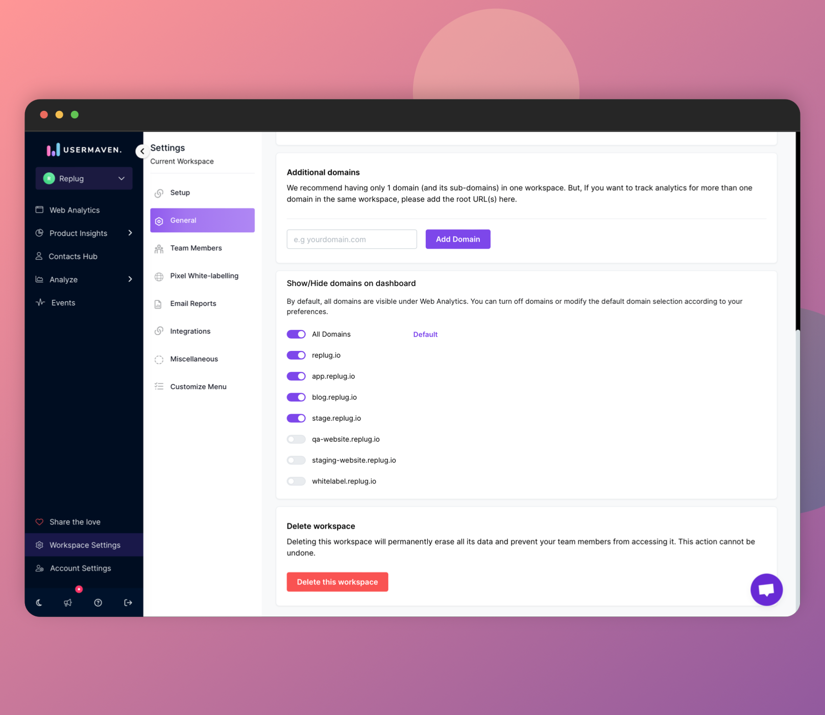
Doing this is a straightforward process:
- Navigate to Workspace settings in Usermaven using the left-side menu.
- Choose "General" and scroll down to the section labeled "Show/Hide domains on the dashboard."
- Activate the toggle for each domain you wish to include in your default view.
- Hover your cursor over "All domains" and click on the "Set as Default" option when it becomes visible.
Multi-domain Data Filtering on the Web Analytics Dashboard
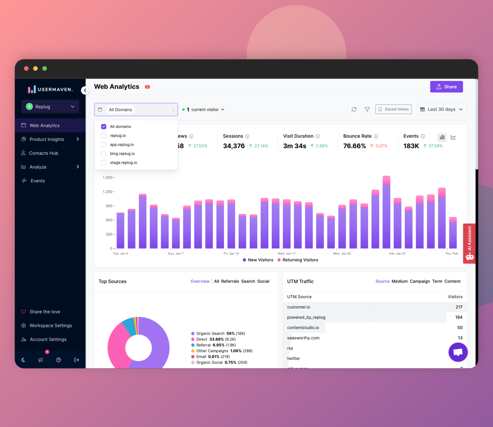
Gone are the days of analyzing one domain at a time! Our new multi-domain data filtering lets you compare and contrast performance across all your domains simultaneously, giving you a holistic view and deeper insights.
With this new functionality, you can now choose multiple domains on your web analytics dashboard, presenting their data concurrently for a more detailed and inclusive view of your statistics. This feature ensures that insights and data from all selected domains are readily available, offering a holistic view on the web analytics page.
Revamped Onboarding Insights: Funnel Deep Dive and User Cards
Unveiling a Powerful Onboarding Dashboard: Say goodbye to the basic funnel! Our upgraded dashboard explodes with insights, offering a comprehensive view of your user journey.
With a myriad of options - dive deeper than ever before!
- Experience the onboarding completion funnel in both horizontal and vertical graph formats, offering diverse visualizations of your data.
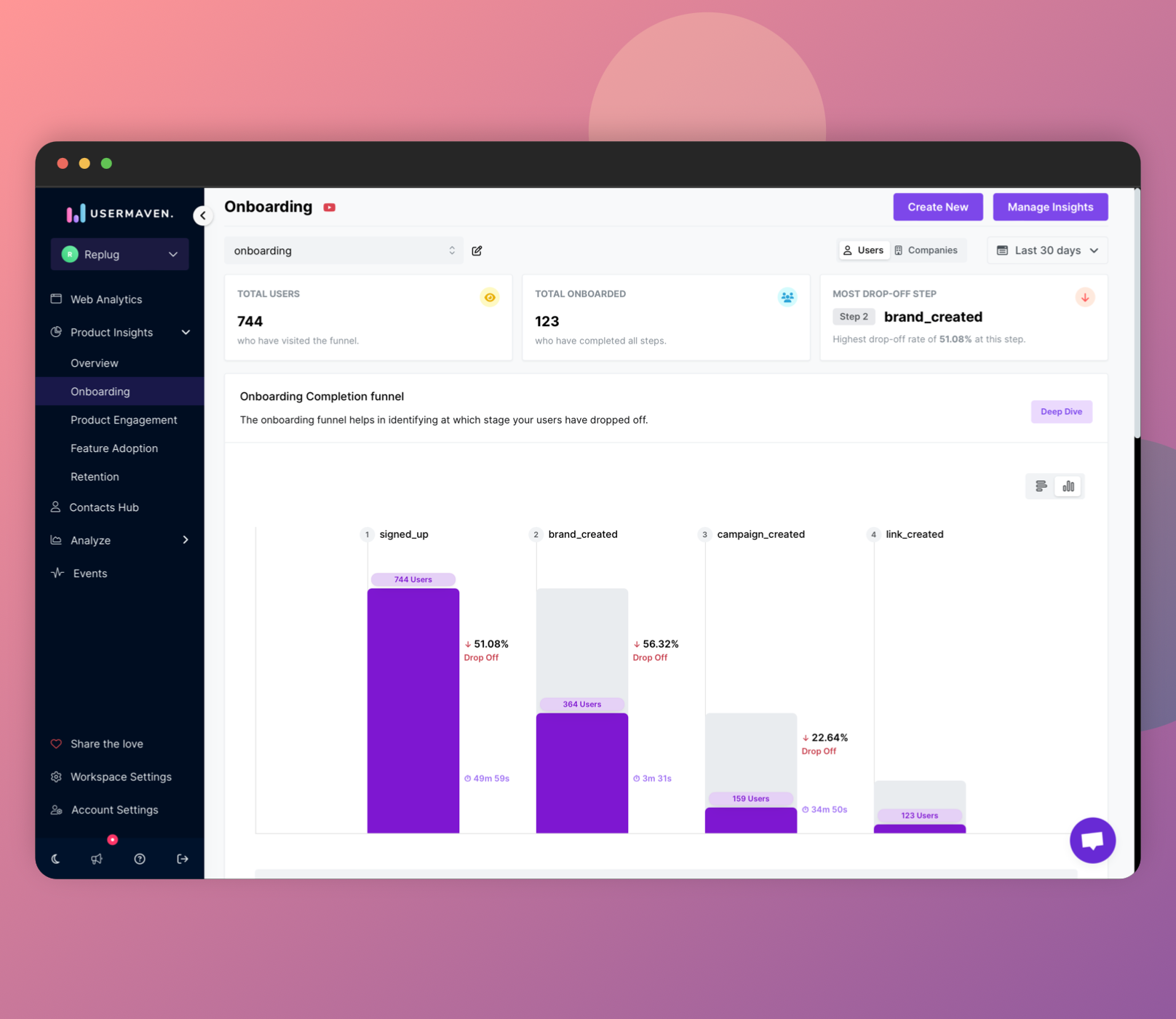
- Want to go deeper into how users find and finish your onboarding? Our new 'Deep Dive' lets you slice and dice the data in easy-to-understand ways. See trends based on where users came from, where they are, and what tech they use! No more boring graphs and tables!
- Detailed view goes beyond graphical and tabular representations, allowing you to break and filter data based on first touch (source, channel, referrer), location (country, city), and technology (device, browser, and operating system).
- You can compare your onboarding funnel over different periods of time, track how your onboarding process works over time to see what's helping and what needs fixing.
- Gain insights into conversion by viewing the average time it takes for your users to complete the onboarding process.
- On the main onboarding dashboard, explore user details through flashcards, highlighting users who have completed each onboarding step. Each flash card provides user names along with their first and last seen details.
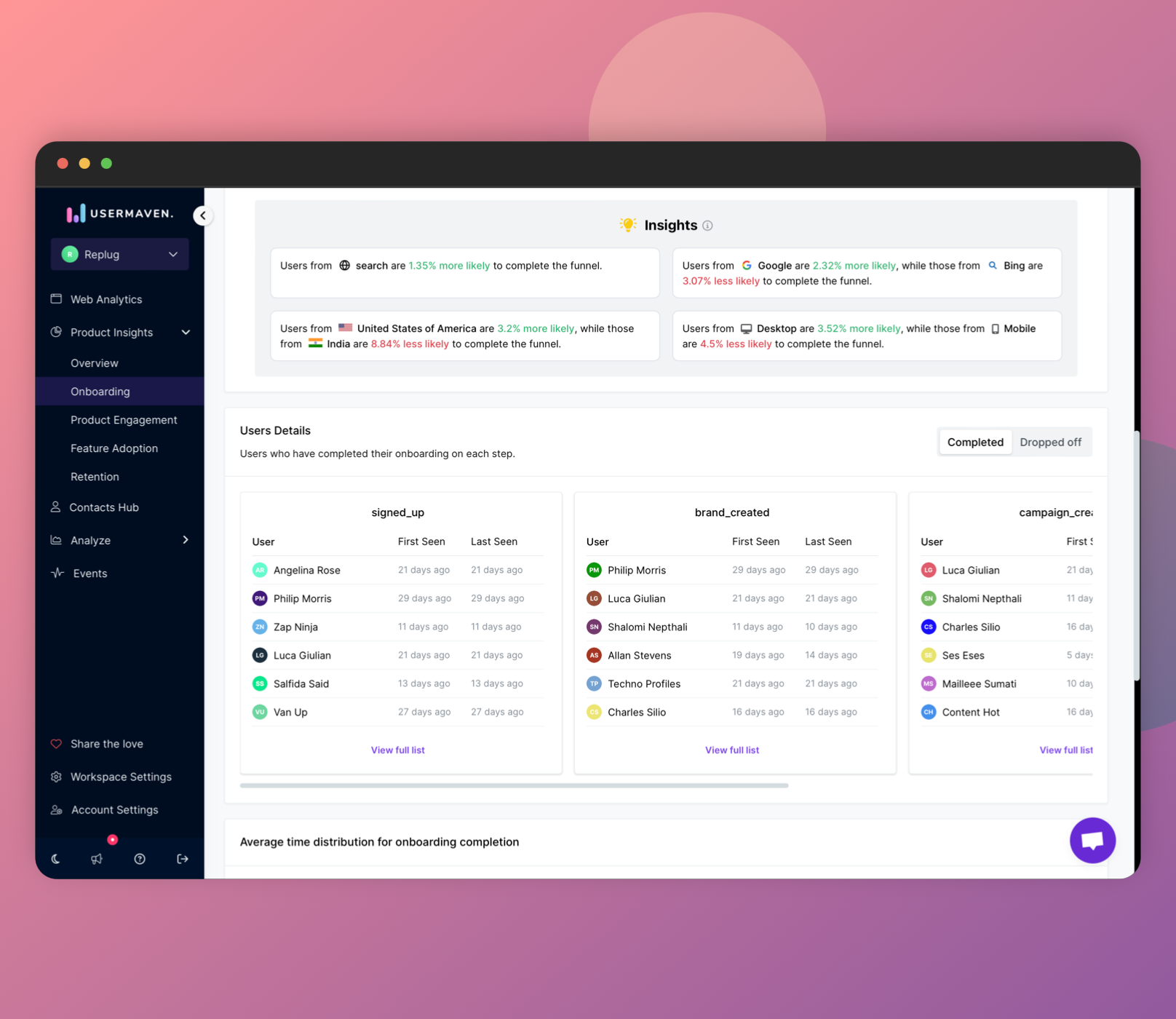
- Easily access the average time distribution for onboarding completion insights directly on the main dashboard.
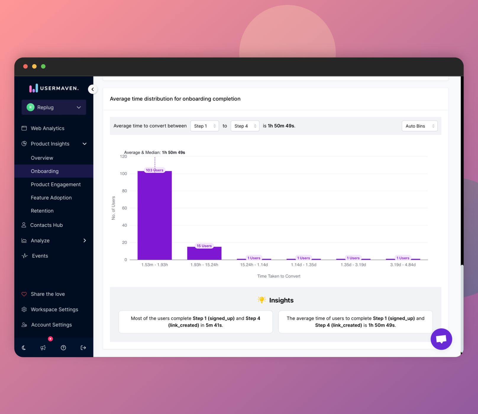
This revamped onboarding dashboard not only enhances the visual appeal but also equips you with a more profound understanding of your user onboarding dynamics, making it your secret weapon for a seamless onboarding experience.
Overhauled Contacts Hub: Seamless Navigation and Enhanced Insights
The Contacts Hub just got a makeover! Forget flipping through separate pages for visitors, users, companies, and groups. Now, a handy sidebar shows them all at once, with quick counts of each so you can find what you need instantly. No more clicking and searching!
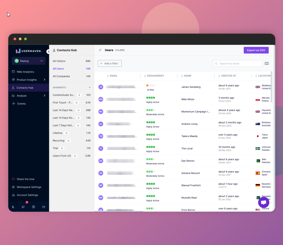
Noteworthy features of this update include:
- New sidebar: Find visitors, users, companies & groups quickly with the revamped sidebar.
- Data at a glance: See how many of each right next to their section – no more searching!
- Direct segment creation: Build new groups of contacts right on the dashboard.
- Easy segment access: See all your groups and open them instantly from a list.
- Company names, not IDs: Say goodbye to confusing codes – names make things clear.
- Better exports: Download users & companies with their unique details included.
The new Contacts Hub makes managing your users and data easier than ever!
Find what you need faster with a new sidebar, build groups of contacts right on the dashboard, and see important info like company names instead of confusing codes. Plus, exporting data is now richer with more details included. It's a more user-friendly way to find insights about your audience.
Conversion Time Distribution
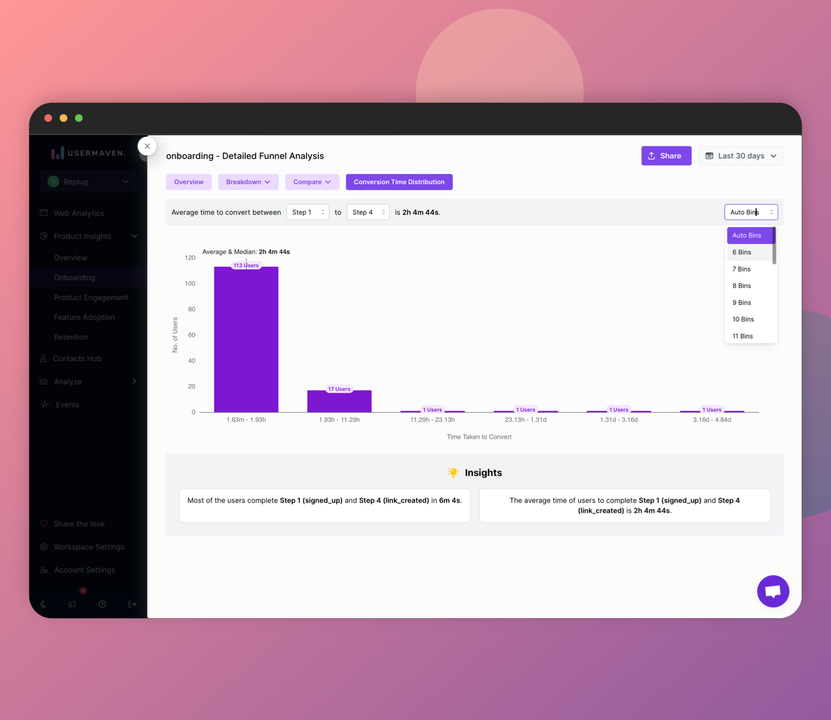
Exciting news! We've added a brand new "Conversion Time Distribution" feature to Usermaven. This cool feature shows you how long people typically take to complete each step of the funnels or onboarding flows you set up.
Want to dig deeper? Both the Onboarding and Funnels dashboards now have a special "Deep Dive" section filled with info about how long people spend on each step. Check it out to see:
Here's a comprehensive breakdown of what awaits you on this page:
- Average Time Breakdown: Discover the average time users took to complete each step within the funnel, as well as the overall average time for the entire funnel.
- Customizable View: At the top of the page, you have the flexibility to choose between viewing the average time for specific steps or the entire funnel. Simply select the desired steps to tailor your analysis.
- Bar Graph: A dynamic bar graph awaits you, corresponding to your selected view. It not only showcases the number of users completing each specified step but also provides insights into the average time taken. The histogram, by default segmented into 5 bins, can be customized up to 25 bins, offering a clear distribution of users completing the funnel within specified time ranges.
- Detailed Insights: Towards the end of the page, dive into detailed insights that provide a comprehensive explanation of the presented metrics. This ensures a thorough understanding of user behavior and time dynamics.
This dedicated page is strategically designed to empower you with actionable insights. It serves as a valuable tool for analyzing and optimizing user engagement based on time-related factors.
Stay tuned for more updates as Usermaven continues its commitment to delivering a powerful analytics tool tailored to your evolving needs!